1. What is the current model setup?
2. How meaningful is the model verification?
3. How are the mean temperature anomalies computed?
4. Why are the model results adjusted towards observations?
5. What is the general difference between Analysis and Reanalysis?
6. What are the disadvantages of the Reanalysis data set?
7. Why show other data set different anomalies or trends?
8. Any further questions?
1. What is the current model setup?
I am using the NCEP/GFS global model forecast data, provided at 0.5 degree horizontal resolution
on a lat/lon grid with 720x361 grid points. Forecast time is 168 hours (7 days) with an forecast
interval of 6 hours. The 2m temperature anomalies are computed using a 30 year climatology (1981-2010)
of the NCEP/CFSR reanalysis data set at the same spatial resolution. The climatology is based on
a 5 day running mean in order to reduce the potentially remaining noise, and hence increase the signal
strength. The forecast is updated every 6 hours at as follows:
00z run (00-168h): 04:35UTC (update begins ~04:20UTC)
06z run (00-168h): 10:35UTC (update begins ~10:20UTC)
12z run (00-168h): 16:35UTC (update begins ~16:20UTC)
18z run (00-168h): 22:35UTC (update begins ~22:20UTC)
Additionally, I am using the lower resolved NCEP/NCAR global reanalysis 1 data at Gaussian T62 grid
(192x94 grid points which roughly corresponds with a 2.2 degree horizontal resolution). The most recent
reanalysis data are used to compute the 2m temperature anomaly based on the 1981-2010 climatology of
the same data set. Four daily runs are available which are daily updated at the same time:
00z-18z run (00h): 13:45UTC (always 3 days behind current date)
All simulation are currently carried out at the servers of the
Oxford University's Center of the Environment (or School of Geography and the Environment, respectively)
which I hereby gratefully acknowledge.
The global domain is available as equirectangular projection as well as Mollweide projection.
The latter has the advantage of a more realistic representation of higher latitudes in general and the
poles in particular. The more commonly used equirectangular projection visually strongly overestimates
said poles, which is particularly obvious in their respective cold seasons as high temperature anomalies
are common place. In addition, four different sub-domains are available and plotted in north or south polar
stereographic projection, respectively: The European, the North American (USA 48), the
Arctic, and the Antarctic subdomain. Bear in mind that the Arctic region and Antarctica are
weakly constrained by observations. Note also that Antarctica is slightly biased cold in the GFS forecast
in comparisons to the CFSR reference data. The southwestern parts of the North American domain might show
too strong a diurnal temperature cycle at times, a feature one can find elsewhere even more pronounced as
discussed in
paragraph 5.
Despite the fact the low resolution of the NCAR/NCEP reanalysis
data set is not perfectly suited for regional purposes, I decided to provide them as they might contain
useful information anyways. Other than GFS/CFSR, it is consistent regarding the underlying atmospheric
model which is used. Long-term and diurnal temperatures biases are hence much less likely.
The GFS anomaly forecast of the previous four runs are available in a
rotating archive,
while the GFS and NCEP anomaly analysis (00h) are available for a longer period of time (6 months).
The monthly anomaly averages of both GFS and NCEP are going to be permanently available, complemented by
the GISS monthly anomaly average. The monthly archive starts in Sept 2011.
2. How meaningful is the model verification?
Provided below the NCEP/GFS forecast, you find a comparison of the current model analysis timestep with
the forecast for the same time step of the previous 29 model runs over the last 7 days (or 168 hours
respectively). In an ideal model world, all images would look exactly the same, which of course won't
ever be the case. Per definition, a model is a simplification of the real world. It goes without saying
that it can't ever be exactly correct. This main goal of this model validation exercise is to get a feeling
of how fast the model forecast typically diverges from that what is the actual analysis. Depending on the
prevalent atmospheric circulation pattern (general weather pattern), the forecast may diverge heavily from
one model run to another already after a few days while it remains fairly stable when large-scale
meterological conditions were less variable. To put it simple, the comparison reveals the average
performance of the model (if verified over long enough a period of time).
Individual hourly meteorological station measurements could be used to identify local model biases from
a hindcast point of view. It is on my list of things to do but may have to wait a while until completed.
3. How are the mean temperature anomalies computed?
Both version of the global forecast are complemented with the average anomaly value over the entire domain.
They are computed using the intrinsic "aaVe" average function in GrADS. Since the circumpolar Antarctic
vortex (the southern hemispheric equivalent to the polar Jetstream in the northern hemisphere) cuts the
Antarctic circulation off the atmospheric circulation to its north, it is treated separately to reduce
the noise in the global anomaly value. You may think of the Antarctic circulation as a climate of its own,
which is disconnected from the rest of the world. It features all sort of extremes, not only in absolute
temperature values, but also in terms of temperature anomaly, which renders the identification of any
climate change related temperature trend extremely difficult. The highly variable annual sea ice behaviour
only adds to the complexity. By the way, from a physical perspective, the Antarctic sea ice is fundamentally
different from the Arctic sea ice. While the first tends to melt almost completely every year (annual ice),
the latter consists of multi-year sea ice that has (up to now) never (in the Holocene) melted completely.
One must not compare the two polar ice caps as distinctively different processes are involved with regard to
the sea ice dynamics. Opposite trends in sea ice area and/or extent are all but surprising.
Thus, one may use the global average anomaly without Antarctica to get a more reliable estimate of
the current truly climate-related temperature anomaly. Please note that at times the GrADS post-processing
average function leads to inconsistent numbers with respect to the global estimate versus the arithmetic
mean estimate of the Antarctic and the remainder of the globe. I am not entirely sure why this is
happening, but the computed values are generally plausible as longer-term validation has shown. Note also
that the 60-90°S anomaly for the Antarctic subdomain is different from that in the global product due
to the adjustments made to better compare the global average with the instrumental data
(see next question).
For the European subdomain, the average for the four spatially largest countries is provided: Germany,
France, the United Kingdom, and Spain. Since GrADS doesn't provide a country-specific averaging tool,
I am crudely estimating the national mean by choosing the grid boxes closest to the relevant geographic
border and hence most appropriate to reflect the region. Keeping in mind that latitudinal partitioning of
grid boxes requires subsequent weighing with a sinus function according to their spatial extent, I was
trying to avoid this procedure as far as possible. In the end, it is a trade-off between errors introduced
by the weighing procedure and errors introduced by having parts of model sea points or adjacent countries
not fully excluded (or by having cut off parts of the country in consideration). For the North American
subdomain, the average for the contiguous U.S. (USA 48), for the Pacific Standard Time zone (PST), the
Mountain Standard Time zone (MST), the Central Standard Time zone (CST), and the Eastern Standard Time
zone (EST) are given. For the Arctic, the zonal mean north of 60°N and north of 66°N, the average
for Greenland, and the average for the Arctic ocean is provided. For Antarctica, the zonal mean south of
60°S and south of 66°S, the land average for East Antarctica, and the land average for West
Antarctica (including Antarctic Peninsula) are provided.
4. Why are the model results adjusted towards observations?
Apart from general computation issues described in the previous paragraph, the deduced anomalies have been
subject to further adjustments. This is due to the fact that both, model analysis and model reanalysis data
are not comparable with observational data in a straight forward fashion. Details as to why there are
differences between the two model data sets as well as what are the shortcomings when it comes to the
comparison with the instrumental record will be given in the next two paragraphs.
I choose the NASA-GISS land-ocean global temperature analysis data set which has the advantage of including
the Arctic ocean and the Antarctic continent. At least its algorithms are trying to make the best of the sparse
data in this region. The disadvantage of this algorithm is, that the smoothing radius is very large (1200
km). It can therefore not be used for the regional domain, even if the higher resolved version with 250 km
smoothing radius is used. Instead I tested the regional GFS model output against the monthly averages
provided by Bernd Hussing.
It turns out, that the GFS model reproduces the magnitude of the observed anomalies and the standard deviation
(variance) very well. Therefore no adjustment is made for the GFS/CFSR product for the European, the North
American, and the two polar subdomains, which, for example, causes the Antarctic anomalies (60-90°S) to be
significantly different in the global and the regional domain. Bear in mind that the reference period for the
climatology used by Bernd Hussing is different. It is 1961-1990 rather than 1981-2010 which requires a
correction of approximately 0.8°C.
A different picture emerges for the NCEP reanalysis, which shows too high a standard deviation also at the
regional scale. Given the highly uncertain approximation for the average temperature anomalies of the
individual countries, I wouldn't take the resulting regional variance in case of NCEP as face value.
Additionally, a positive bias with regard to the reference period became manifest (caused by a potential
negative bias in reference period as discussed below). Both, NCEP and GFS/CFSR show too high a standard
deviation at the global scale. This shouldn't come as a surprise given the coarse spatial GISS resolution.
But as it is my goal to provide a reasonably consistent comparison with the best available instrumental
data set, I think the adjustment of the models standard deviation and base line to that of the GISS analysis
is well justified. While the model bias is in the order of +0.1K, the reduction of the model standard deviation
is more substantial (in the order of 30-40%).
In conclusion, the NCEP reanalysis is equally adjusted at the global and regional scale, while GFS/CFSR is
adjusted only at the global scale. This is entirely consistent within the limits of the different models
and observational data sets used (see below), as well as the inherent averaging uncertainties as pointed
out before. After all, it is merely an attempt to make it an apples to apples comparison. The monthly mean
can still vary between +/- 0.1K between the different data set. It depends partly on the season, but mainly
on the spatial distribution of the anomalies. Strong mid-latitudinal or even subtropical anomalies will
ultimately lead to stronger deviations in the model based products (GFS/CFSR, NCEP) compared to GISS. Hence
the predictive power of the models should not be overestimated.
5. What is the general difference between Analysis and Reanalysis?
Generally, the term reanalysis was coined from weather forecasting groups in order to distinguish this type
of post-hoc analysis from the most up-to-date model analysis which is merely a snapshot of the current
weather as indicated by the available data at that very time. Not only will there be more observations
available at a later stage, but will those be also quality checked and potentially rejected. To reflect these
improvements, weather forecasting centers started to do reanalysis simulations. In doing so, they were
additionally aiming at producing a more consistent long-term data set which allows to draw reliable
conclusions regarding the long-term climate trend. As models physics and dynamics improve over time, an
unavoidable model bias would be introduced which prevents researchers from the detection of meaningful
trend estimates. The fact that new data are sometimes added to the mix, further complicates matters.
To cut a long story short, the reanalysis time series are homogenous in that the model is the same all
the way through (which is not the case for the analysis), using quality assured input data exclusively.
They are trying to extend these simulations as far back as the beginning of the instrumental record,
though being afflicted with residual problems and uncertainties in the early part of the record because
of data source changes or a fundamental lack of data as discussed in the next paragraph. The NCEP reanalysis
1 product is updated forward in time up until two days of the current date.
As the main differences between analysis and reanalysis have been pointed out, one should generally keep
in mind that the model 2m air temperature is a diagnostic variable based on the underlying model physics
and dynamics. It is not a direct model input parameter (vertical model levels are initialised with
observational data such as pressure, wind speed, temperature and humidity from rawinsondes/radiosondes;
plus initialisation of four model soil layers down to 2m). Hence different models may diagnose distinctively
different 2m temperatures (same is true for 10m wind speeds). Some may not allow super-adiabatic
conditions close to the surface, other might apply a different surface or turbulence scheme. Each
component will have an impact on the final model 2m temperature diagnostics.
While this isn't an issue for the provided NCEP reanalysis runs, it certainly is an issue in case of
the GFS/CFSR results since two different models (though at the same horizontal resolution) are combined.
Note for example, that there appears to be a strong diurnal cycle present not only in the
global temperature anomaly estimate in case of GFS/CFSR, but also from a visual inspection over
Northern Africa or the Saharan desert region, respectively (same over southwestern portions of North
America at times as mentioned earlier). While it could be an artefact of the extremely limited data
availability over that region, which as a consequence leads to a poor initialisation of the GFS model,
it could equally well be caused by differences in the soil moisture budget. Soil moisture is a weakly
constrained model parameter anyways, yet it has a substantial effect on the diurnal temperature cycle.
There may also have been taken measures to correct for such known biases in the reanalysis data.
So please be careful in interpreting the model forecast particularly over sparsely instrumentally
covered regions (also true for polar regions).
 When it comes to the comparison with the instrumental record (see discussion of the adjustment procedure
in the previous paragraph), one might expect to see even stronger discrepancies. While analysis and
reanalysis products are based on models which rely on observations for initialisation, instrumental analysis
data set such as GISS, NCDC or HadCRUT4 are solely based on the available observational data. Rather than
filling the gaps with an atmospheric model, sophisticated algorithms are applied that are not only aiming
at correction for well known biases such as the urban heat island effect, or the unevenly globally
distributed station record, but also at interpolating the station data, likewise in remote regions as well
as over the oceans. Given these fundamental differences, the agreement between the two products is
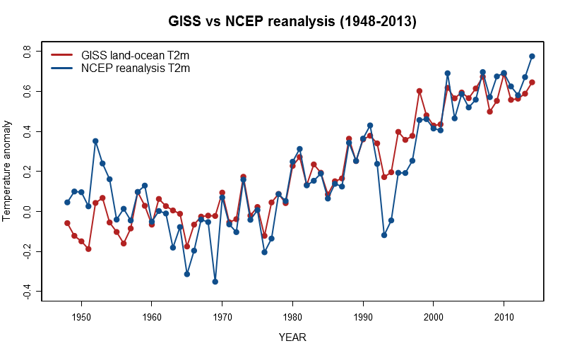
surprisingly good. To illustrate the point, I plotted the 2m temperature anomaly of the GISS land-ocean
data and NCAR/NCEP reanalysis for the period between 1948 and 2013 (upper left hand plot).
When it comes to the comparison with the instrumental record (see discussion of the adjustment procedure
in the previous paragraph), one might expect to see even stronger discrepancies. While analysis and
reanalysis products are based on models which rely on observations for initialisation, instrumental analysis
data set such as GISS, NCDC or HadCRUT4 are solely based on the available observational data. Rather than
filling the gaps with an atmospheric model, sophisticated algorithms are applied that are not only aiming
at correction for well known biases such as the urban heat island effect, or the unevenly globally
distributed station record, but also at interpolating the station data, likewise in remote regions as well
as over the oceans. Given these fundamental differences, the agreement between the two products is
surprisingly good. To illustrate the point, I plotted the 2m temperature anomaly of the GISS land-ocean
data and NCAR/NCEP reanalysis for the period between 1948 and 2013 (upper left hand plot).
 They indeed agree fairly well. It is only in the first few years and the years during and past the eruption
of the Pinatubo in 1992 that they significantly differ. The major discrepancy during years with strong
volcanic eruptions could potentially be explained by the fact that the model used for the reanalysis does
not reproduce the ENSO (El Nino Southern Oscillation) state correctly, despite the continued re-initialisation
with observational data. Given that a strong El Nino followed two of the three major volcanic eruptions
in the latter half of the last century, the full magnitude of the volcanic response is not identifiable by
looking only at observational data. Using multiple regression analysis, the instrumental record can be
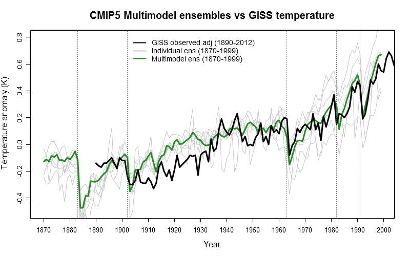
corrected for counterbalancing ENSO effects. In doing so, the Pinatubo response is now much stronger and
compares well with CMIP5 climate model results (lower left hand plot).
They indeed agree fairly well. It is only in the first few years and the years during and past the eruption
of the Pinatubo in 1992 that they significantly differ. The major discrepancy during years with strong
volcanic eruptions could potentially be explained by the fact that the model used for the reanalysis does
not reproduce the ENSO (El Nino Southern Oscillation) state correctly, despite the continued re-initialisation
with observational data. Given that a strong El Nino followed two of the three major volcanic eruptions
in the latter half of the last century, the full magnitude of the volcanic response is not identifiable by
looking only at observational data. Using multiple regression analysis, the instrumental record can be
corrected for counterbalancing ENSO effects. In doing so, the Pinatubo response is now much stronger and
compares well with CMIP5 climate model results (lower left hand plot).
The NCEP reanalysis is still a bit "over the top", but it is now closer to observations. Sure that
some of the issues raised in the following paragraph play also a role in explaining the discrepancies.
Regardless of the cause, the NCEP reanalysis climatology for the 1981-2010 period will almost certainly
have a negative bias. In fact, this is confirmed by the comparison with the GISS data, which led me to
adjust the reanalysis data in order to make up for this very bias as mentioned in
paragraph 4. In my opinion, it does not undermine the validity of the data and is entirely consistent
with well understood physics.
6. What are the disadvantages of the Reanalysis data set?
Such as other reanalysis products or projects - in fact, there are a number of them (ERA, MERRA, JAXA) -
the NCEP reanalysis project (likewise the latest NCEP/CFSR project) feeds all suitable measurements into
their atmospheric model, i.e. measurements that are quality checked. The model was state-of-the-art in
the mid-1990s when the reanalysis project was started. It is accompanied by a global data assimilation
system and runs at a horizontal resolution of 192x94 grid points (Gaussian T62) with 28 vertical levels.
Given that it incorporates all information that are at our disposal these days (satellites, ground
observations, ships, buoys, aircrafts, rawinsondes, radiosondes), it represents the most complete and
accurate picture of the current atmospheric conditions. However, these improvements in the observational
network may cause problems when studying trends as evident in the figure above for the earlier period of
time. Tt is therefore indispensable to look also at individual long-term series of high quality which
have to be homogeneous (consistent through the course of time in that they must not be affected by
changes in the local environment, instrumentation, and measurement practices).
The reanalysis is closely tied to measurements at locations where observations are provided. By means
of the data assimilation process, the model is made to follow the observations as closely as possible
at the locations where they are provided. On the one hand, this constrains the model in regions where
sparse measurements are available as atmospheric conditions does not change abruptly over short distances.
On the other hand, in remote regions where observational data are absent, much is left for the weather
models to predict in an unconstrained way. Over such regions, the description of the atmospheric
conditions can be biased by model shortcomings. Not to mention that differently represented surface
features such as orography (due to different spatial model resolution) lead to inter-model differences
over unconstrained terrain.
As already mentioned, soil moisture can affect the 2m temperature through changes in the heat fluxes
between ground and atmosphere. The same is true for precipitation which, together with the heat fluxes,
are computed by the reanalysis model without direct constraints, and therefore only loosely tied to
the observations fed into them. To complicate matters, they can vary substantially over short distances.
Quite a rich source of uncertainty, particularly over regions with a high amount of insolation.
With regard to data quality, note that although screened through a quality control to eliminate
outliers and misreadings, sometimes also valid data might be thrown away erroneously as it was the
case with Antarctic ozone hole data which were unrealistically high ... but true nonetheless as it
later turned out. The screening criterion selects data according to what appears to be a plausible
value within the commonly known limits.
Despite these limitations, the reanalysis projects are probably the best assessment of what the
historical weather was like in the last half century. Trends of any sort have should be interpreted
very carefully as they might not always be what they seem. This is also the case when it comes to the
question whether they provide a sufficient basis for making meaningful inferences about extreme
temperatures and unprecedented heat waves. In fact, the aforementioned changes over time in the number
and type of observations being fed into the reanalysis model requires caution for all types of climate
change related studies and trend analysis, regardless of the beneficent fact the model itself has never
changed. However, more traditional analyses (such as GISS) are also partly affected by the issue of
changing observational data and instruments.
7. Why show other data set different anomalies or trends?
At some stage, you will very likely stumble upon a global anomaly map or any sort of global temperature
trend estimate which is in disagreement with what's shown here. I am not simply referring to different
global temperature data set such as NCDC, HadCRUT4, or even purely satellite based products such as RSS
and UAH which are different by nature. Rather, I am referring to other websites which seem to be using
similar data. For example, the now commercialised
Weatherbell page is apparently using the same climatology (NCEP CFSR) but still comes up with a
strikingly different global anomaly estimate.
I believe that there are two main reasons for that. First, instead of the GFS model, the higher resolved
NCEP CFS v2 is used to deduce the anomalies. Second, since the CFS v2 are not available before 2011 they
seem to have not been appropriately stitched together. There is a clear
inhomogeneity in April/May 2010 which is inconsistent with
observations. Past that point in time, the temperature is therefore erroneously biased low by
approximately 0.2-0.3K. I don't know whether these maps are also used in the premium section, but I urge
people to be skeptical about contradictory information of which you can find plenty on the internet due
to vast amounts of deliberately spread misinformation by climate contrarians. Ironically, the owner of
the Weatherbell website is one of the most prolific contrarians (Joe Bastardi). So perhaps no coincidence
as to why this inhomogeneity is present.
 Speaking of misinformation, let me briefly refute the frequently disseminated myth that global warming
has mystically stopped 15 years ago (or whatever number you may wish to put). That claim is simply
wrong and does not hold water at all. While 10-15 years without a new global temperature record are
exactly that what one can expect to observe once in a while given the intrinsic natural variability of
the climate system (mainly controlled by ENSO and expressed in term of the standard deviation of the
global temperature), also the underlying climate forcing is not constant over time.
The background concentration of WMGHG (well mixed greenhouse gases) may well increase constantly, but
solar, volcanic, and anthropogenic aerosol forcing are highly variable and cannot be determined easily.
At least not near real-time. For example, it takes several years to determine the volcanic and the aerosol
forcing with some level of confidence. As it happens, at least solar and volcanic forcing (due to many
smaller eruptions in recent years) have both been acting to reduce the total forcing over the last decade.
As a results, the sum of all forcings only rose slightly over the past decade. But still, global
temperature kept rising, even without considering the tendency of ENSO towards more frequent La Nina events
(which tend to cool the globe) in recent years. This is particularly true over land, where global warming
continues unabated as expected and well in agreement with global climate models. In the upper left graph,
a visual impression of what has just been said is provided.
Speaking of misinformation, let me briefly refute the frequently disseminated myth that global warming
has mystically stopped 15 years ago (or whatever number you may wish to put). That claim is simply
wrong and does not hold water at all. While 10-15 years without a new global temperature record are
exactly that what one can expect to observe once in a while given the intrinsic natural variability of
the climate system (mainly controlled by ENSO and expressed in term of the standard deviation of the
global temperature), also the underlying climate forcing is not constant over time.
The background concentration of WMGHG (well mixed greenhouse gases) may well increase constantly, but
solar, volcanic, and anthropogenic aerosol forcing are highly variable and cannot be determined easily.
At least not near real-time. For example, it takes several years to determine the volcanic and the aerosol
forcing with some level of confidence. As it happens, at least solar and volcanic forcing (due to many
smaller eruptions in recent years) have both been acting to reduce the total forcing over the last decade.
As a results, the sum of all forcings only rose slightly over the past decade. But still, global
temperature kept rising, even without considering the tendency of ENSO towards more frequent La Nina events
(which tend to cool the globe) in recent years. This is particularly true over land, where global warming
continues unabated as expected and well in agreement with global climate models. In the upper left graph,
a visual impression of what has just been said is provided.
The global trend of the past 30 years is approximately +0.16K/decade. The regression line (not plotted)
exactly reflects the climate trend which is defined to be 30 years. As long as the regression line keeps
rising, the modern GHG induced warming trend continues. That is entirely consistent with the fact that one
may not observe a positive temperature trend over a deliberately chosen 10 or even 15 year interval of time.
In doing so, one would be looking at the climate noise rather than the climate trend. Only the latter
contains any sort of useful information. Referring to the first in an attempt to make climate relevant
statements is merely misinformation. Unfortunately, it is all too easy to fall for these false and
misleading arguments. And as already mentioned, you find plenty of them on the internet (probably more
than 80% are utter rubbish) as well as in countless (preferably conservative) media outlets, who try
to spread these myths in an effort to discredit the science and to downplay the risks of global warming.
Again, please try to make sure that you pick a trustworthy source which gets the facts right.
Sad that such cautionary statements are necessary these days in the first place ...
8. Any further questions?
In case there are things which I forgot to address, things that I failed to explain in an understandable
fashion, or other questions related to the issue at hand remaining, please don't hesitate to contact me.
I am happy to answer them as good as I possibly can:
post@karstenhaustein.de
If you wish to know more about my scientific background, check my academic profile (which isn't always
quite up to date regarding the references):
Oxford University Staff
Finally, I refer once again to Janeks excellent website, which offers a wide range of numerical weather
prediction products at different scales (up to 4km spatial resolution), mainly based on the WRF-ARW
atmospheric model. In this context, I would like to take the chance to thank him very much for
cross-linking the anomaly maps :-):
Central European domain (4km resolution) and
Full European domain (12km resolution)